One thing that never fails to amaze me is the lack of functionality in banking websites. From strange or confusing designs, to cluttered registers, and even completely unreadable formats…these are all common issues. Not to mention the standard broken links, server issues and out of date features.
This is a problem with banks both big and small. Some major names in the financial industry have websites so bad that they look like they hired a teenager in the 90’s to handle create it using Geocities. It truly is astonishing that in today’s world of online banking popularity, more effort has not gone in.
If you are planning on creating a banking website, either for a branch or a new online currency service, the best thing you can do is get inspiration from existing sites. These five financial websites have used great design trends that you can follow to get you started.
Barclays
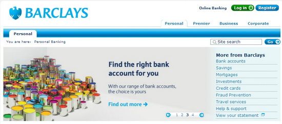
Not all grids have to be simple. Barclays used various sized columns set through the page, along with bold headers, in order to provide a user friendly site with everything right there on the front page. You don’t have to click through multiple links to find what you are looking for. While the design is more cluttered than other grid based sites, it is clean and functional. The light use of thumbnail images manages to break it up without creating a “block text” effect.
Legg Mason

The small slideshow at the top of the page is very popular right now. It is used for presenting more attractive links, to work in the same was as advertisements. Users can click on the small boxes in order to find what they are looking for. The rest of the site is created on a unique grid design that is further personalized by the images of employees.
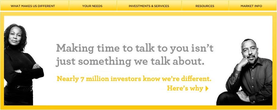
Alliance Berstein

An alternative to the slideshow idea is a simple selection box, complete with graphics. They have used it well here, adding color to a black and white design. The rest of the site is built in a way similar to a blog, which is a trend that bis emerging as companies take advantage of the benefits of social media. Plus, they have the drop down menus from the tabs, which makes it easier to navigate.
Edward Jones
This site shows the way that bright colors can be toned down using different shades, for a more professional look. Rather than a bright yellow, they use something closer to marigold. Then, they further mingle intermediates with a smokey gray, instead of the stark look of black. This makes the photos look more dynamic, while making the site itself immediately recognizable.
Star

Star utilizes the increasingly popular image-heavy design. The background image is bright and cheerful, and the actual site is very small in the center. Links are all in the banned above, with limited links in the boxes near the bottom. Then, in the center, they give you a slideshow. You have to be careful about color arrangement and chosen images, with this kind of site. It is also not as user friendly as some others.
Conclusion
Making a banking site takes some prowess and thought. It has to be easy to navigate, aimed at the satisfaction of the customer and attractive while being functional. Certain trends have emerged to provide all of this, and the five examples above are some of the best.
What banking sites have you seen that can inspire an interesting design? Let us know in the comments below.
Jessy Troy is a creative writer for Dobofo, the free geeky tool to choose the best apartments in Kiev.
TweetTags: bank website, design a bank website, design a website, web design, website design